A betting-led redesign that shifted Noxwin from casino-first discovery to daily tips, bookmaker comparison and clearer offer paths.
View live site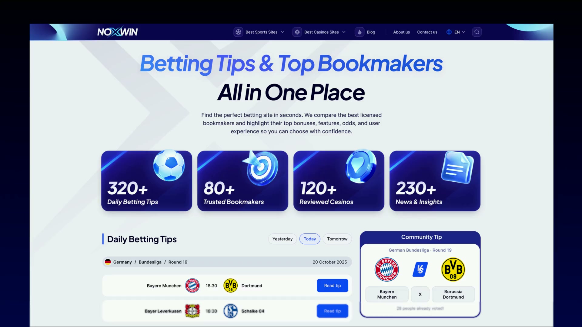
Noxwin began as a broad iGaming affiliate site, but user intent was moving toward sports betting. I reframed the product around a simpler path: find a tip, compare the right bookmaker, then choose a relevant offer.
The Problem
The old experience treated casino content, sportsbook comparison and offers as equal priorities. For users arriving with betting intent, the first decision was harder than it needed to be.
The Goal
The goal was to let betting intent lead the experience: surface tips earlier, simplify bookmaker comparison, and make offers easier to act on.
Lead with betting tips
Surface daily betting tips before casino content takes over.

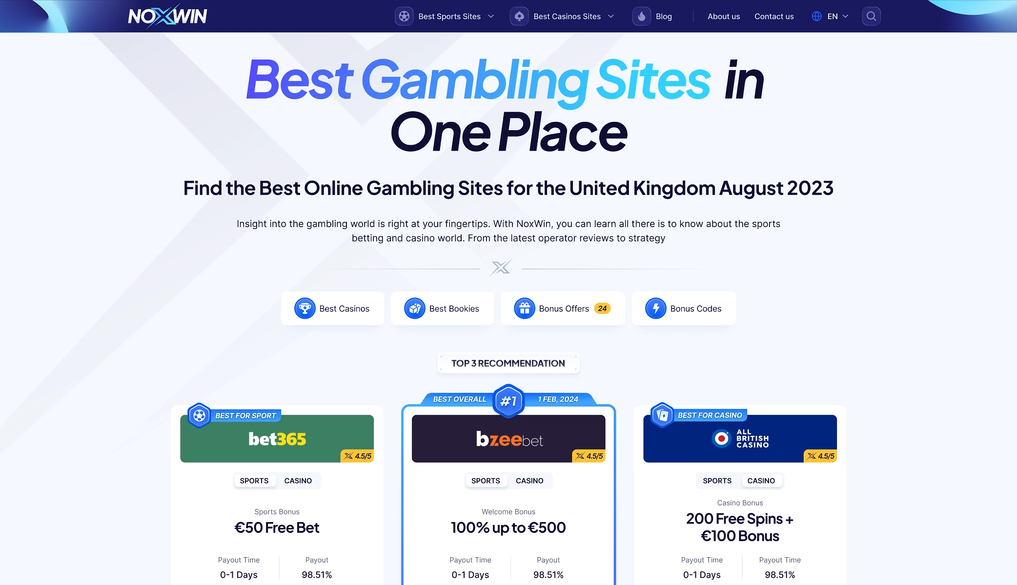
Clarify bookmaker comparison
Group rating, bonus and trust cues into one scan-friendly view.

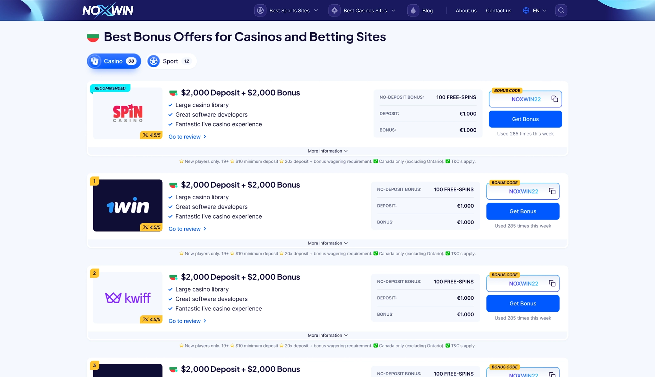
Make offers easier to choose
Use filters to help users narrow long offer lists faster.

Key Design Decisions
The redesign followed one decision path: start with betting intent, support comparison, then make the next offer easier to choose.
Users arrived with betting intent, but the old page pushed casino and offer content first. I moved daily tips higher in the flow so the page could answer the immediate need before guiding users toward a bookmaker.

The card stays compact for scanning, then expands to show rating, payout, bonus and review details when users need more confidence.

Long offer lists made users scroll and guess. Filters turned the list into a controlled path, helping users narrow offers by intent instead of scanning every option.
Design System
The system had to keep a content-heavy product readable across tips, bookmaker cards and offer pages. Shared colors, icons, buttons and type rules kept each layer connected without making the interface feel repetitive.


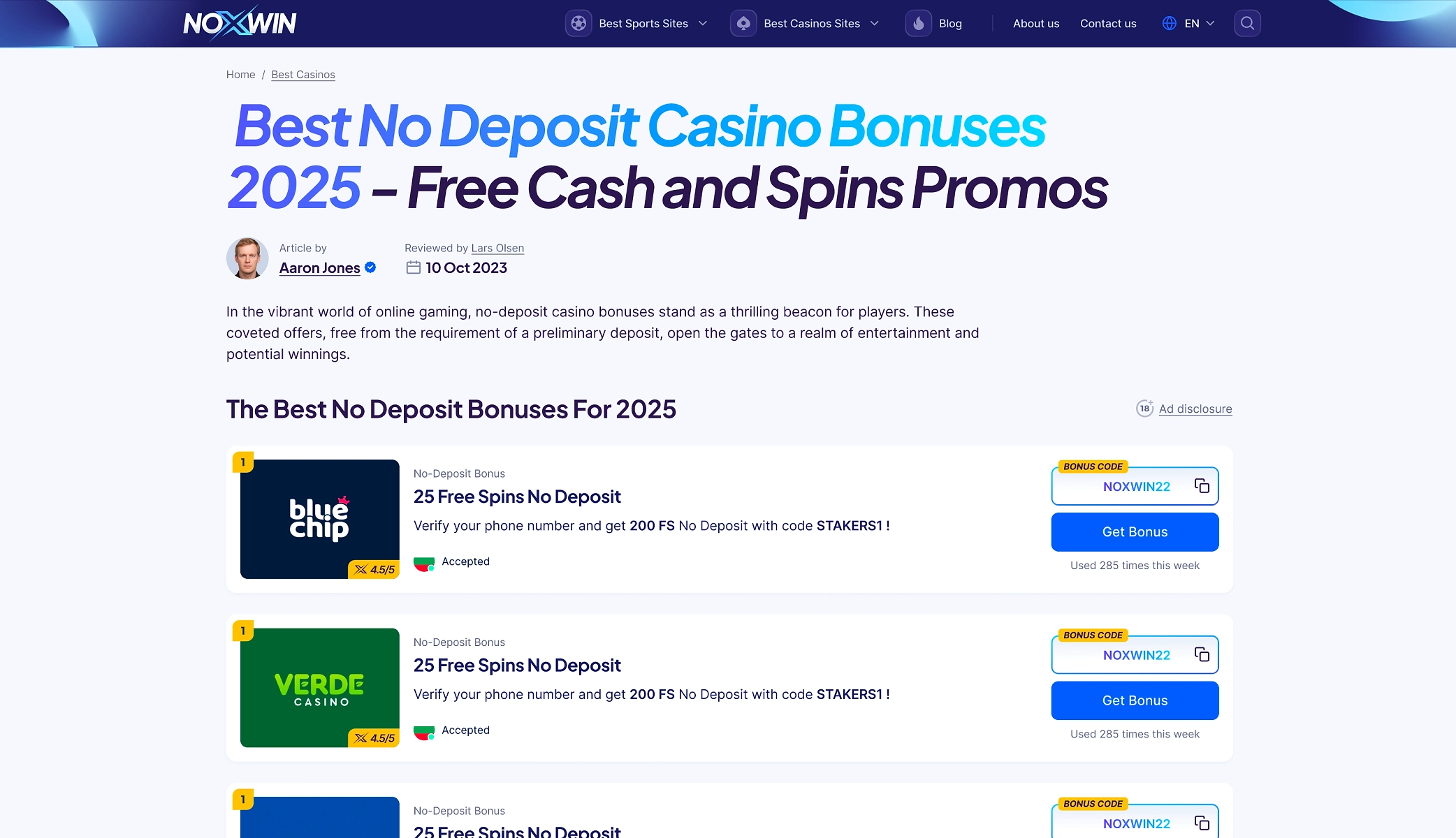
Supporting Casino Content
Casino content still mattered. Game tiles, feature cues and review cards were redesigned so legacy pages could fit inside the new system.


Shared visual cues kept casino content aligned with the betting-led system.
Mobile / Responsive
On mobile, the same order stayed intact: tips first, comparison second, offers after context. The layout reduced visual noise without changing the decision flow.


Final Experience
The final experience connects the full journey: users enter through betting content, compare bookmakers with clearer signals, and move toward offers only after the context is established.
Outcome & Reflection
The redesign gave Noxwin a stronger product direction. Betting content stopped feeling like an add-on and became the entry point. Once the journey was structured around tips, comparison and filtered offers, the product felt easier to scan, extend and grow.
Structure before visuals
The product needed a clearer journey before the interface could feel finished.
Intent drives hierarchy
Tips, comparison and offers had to follow the order users make decisions.
Systems make growth easier
Reusable cards and filters made future pages easier to extend.